4%
UI/UX + RWD AI Generated image 5
 

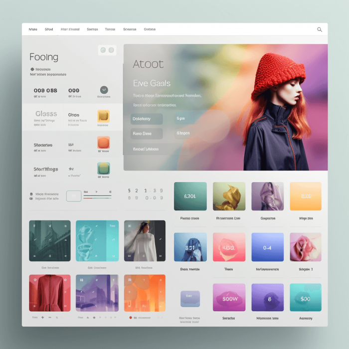
User Experience (UI/UX) and Responsive Web Design (RWD) are like the dynamic duo for e-commerce websites!

First off, UI/UX is all about creating a seamless and enjoyable journey for users on your site. When visitors have a pleasant experience navigating your online store, they're more likely to stick around and, more importantly, convert into loyal customers. With a user-friendly interface and intuitive design, customers can easily find what they're looking for, making the shopping process a breeze.

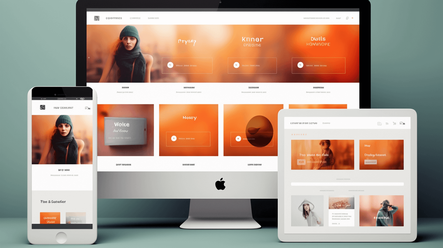
Now, let's talk about RWD – this tech-savvy superhero ensures your e-commerce website looks awesome on any device, be it a laptop, smartphone, or tablet. Gone are the days when people were tethered to their desktops for online shopping. Nowadays, everyone's on the go, and with RWD, your site adapts to different screen sizes, maintaining its fantastic appearance and functionality. That means no more frustrating pinch-and-zoom or squinting to read product descriptions!

Together, UI/UX and RWD create a dream team that not only boosts user engagement but also maximizes your conversion rates. When customers have a seamless shopping experience across devices, they're more likely to trust your brand and come back for more. So, invest in these powerful allies, and watch your e-commerce business soar to new heights! Happy selling!

 
UI/UX + RWD AI Generated image 7
UI/UX combines creative design elements with user interactions to establish a smooth user experience
 

How to succeed at UI/UX:

  • Engaging User Interfaces

    We create interfaces that are not just functional but visually stunning, leaving a lasting impression on your visitors.

  • Seamless Navigation

    Our designs prioritize user-friendliness, ensuring visitors can easily find what they're looking for, leading to higher engagement and conversions.

  • Mobile Optimization

    With RWD, your website will look and perform flawlessly on any device, increasing your reach and accessibility.

  • Faster Loading Times

    Our optimization techniques guarantee lightning-fast load times, keeping impatient users engaged.

  • Enhanced SEO

    Google loves responsive design, which means better search engine rankings for your site.

  • Improved Conversion Rates

    A user-centric design and smooth user experience lead to more conversions and higher ROI.

  • Cross-Browser Compatibility

    Your site will work perfectly across various browsers, reaching a wider audience.

  • Brand Consistency

    We maintain your brand's integrity across all devices, ensuring a cohesive online presence.

  • Scalability

    Our websites are built to grow with your business, accommodating future expansions effortlessly.

 
UI/UX + RWD AI Generated image 8
RWD offers creators multiple canvases, tailoring unique layouts for each device, from smartphones to wall-mounted monitors


What is RWD?

Responsive web design (RWD) is essential for ensuring that websites look and function well on various devices and screen sizes. Several technologies and techniques are commonly used in responsive web design to achieve this goal:

 
  Media Queries

Media queries are a fundamental part of RWD. They allow developers to apply CSS rules based on characteristics such as screen width, height, and device orientation. This enables the adaptation of layouts and styles for different devices.

  Flexible Grid Layouts

Grid systems like CSS Grid and Flexbox provide a way to create flexible and responsive layouts. They allow designers to define how elements should behave in different screen sizes and orientations.

  Viewport Meta Tag

The viewport meta tag is used to control the viewport's initial scale and dimensions. It's essential for ensuring that websites are properly scaled on mobile devices.

  Fluid Images

Using CSS properties like max-width: 100%; ensures that images scale proportionally to their parent container, preventing them from overflowing or becoming too small on smaller screens.

  Responsive Typography

Techniques like using relative units (e.g., em, rem, vw, vh) for font sizes and line heights help maintain readability across different devices.

  CSS Preprocessors

Tools like SASS or LESS make writing and managing CSS easier, which is particularly useful in complex responsive design projects.

  Responsive Frameworks

Frameworks like Bootstrap, Tailwind, and Foundation offer pre-built responsive components and grids that can significantly speed up the development process.

  Mobile-First Design

Designing for mobile devices first and then progressively enhancing for larger screens has become a popular approach in responsive design.

  Conditional Loading

Techniques like lazy loading images and conditional loading of resources based on screen size or device capabilities can improve website performance.

  Responsive Images

The <picture> element and srcset attribute in HTML5 allow developers to provide different image sources for different screen sizes and resolutions.

  CSS Media Features

Beyond screen size, CSS media features like orientation, aspect-ratio, and hover can be used to fine-tune responsive design based on specific device capabilities.

  Browser Developer Tools

Modern web browsers offer developer tools that allow designers and developers to test and debug responsive designs in real-time.

 
UI/UX + RWD AI Generated image 9
Front Line Dev infuses creativity into every project by harmonizing contemporary design principles with the aesthetic preferences of our clients


Our Approach
Cross-Browser Fully Responsive Websites

100% U.S. ON-SHORE DEVELOPERS & SUPPORT

Expertise: Our team comprises technical experts who can seamlessly integrate winning solutions into your website.   Responsive Design: We ensure your website works flawlessly on all screens, from iPhones to wall-mounted monitors.   Continuous Upgrades: We keep your site up-to-date with the latest technologies and vital updates.   Coding Excellence: Our coding standards meet the highest industry benchmarks.   Custom Extension Building: Whether you need a custom extension from scratch or modifications to existing ones, we've got you covered.  

Disabled American Veterans logo
Service-Disabled Veteran-Owned Certified logo
Kentucky Service Disabled Veteran Owned Small Business logo

“They created a stunning website for our athlete focused online store. Their attention to detail and creative solutions were invaluable. We're grateful for their exceptional service!”

Laura D. VP Infinit Nutrition

Join us on the journey to elevate your online presence and convert visitors into loyal customers. Contact Front Line Dev today, and let's build something amazing together!